
Consider the acorn: Small. Humble. Full of potential.
Now, the oak tree: Mighty. Majestic. The promise of potential realized.
The Anderson University Office of Marketing and Communication has spent the last two years thinking a lot about the acorn and the oak. One reason is that they are cherished symbols for our University–metaphors for the journey our students take from the moment they arrive on campus as first-year undergraduates, to the moment they join the ranks of our alumni family.
Anderson University President Evans Whitaker often explains the symbolism of the acorn and the oak with an ancient proverb: “Mighty oaks from tiny acorns grow.”
It is that beautifully succinct phrase that served as our foundation. With the support and encouragement of the Anderson University Board of Trust and its Senior Leadership Team, we are providing a new visual identity for the University.
It is the first comprehensive rebranding effort in several years. And it all starts with the acorn. And the oak.
Since its foundation in 1911, the story of Anderson University has been one of Great Academics, Great Faith, Great Purpose and Great Hospitality. Those foundational pillars are represented in our former brand identity that is both beloved and that has stood the test of time.
Make no mistake: The pillars upon which the University was built and continues to grow has not—and will not—change, said Senior Vice President of Administration and Brand Omar Rashed.
“We often talk about the four pillars of distinction, and how they inform everything we do as a campus community. Academically we are comprehensive, entrepreneurial, and we provide a rigorous learning environment. Of course, faith is central to who we are as well; we are committed to the spiritual growth of our students and our faculty and staff,” Rashed said.
“Great Hospitality speaks to the pride we have in providing a warm, supportive environment, and Great Purpose is all about helping our family members find the unique call on their lives,” he says. “Those foundational values remain even as we seek a new, creative way to present ourselves locally, regionally and globally.”
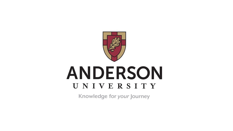
- The new Anderson University logo consists of updated typography that is cleaner. It has a more modern look and feel, but holds true to the University’s status as a well-respected institution known as one of the top Christian universities in the country.
- Our new shield begins with the gospel truth of Solus Christus, represented by the cross. It professes our Christian faith, reinforcing our Mission Statement, Vision Statement, Values and Statement of Faith. That sacred symbol is central to our identity, and makes clear that Anderson University is a diverse community that is intentionally centered on Christ.
- And that brings us to the acorn and the oak leaf. Adorning the cross, these two symbols are both literal and figurative. On the one hand, they represent the majestic 100-year old oak trees that adorn the University campus. More significantly, the acorn and the oak leaf are symbolic of our students’ present and future journeys as life-long learners, growing in knowledge, wisdom and truth, enduring with strength.
“We are very excited about our new brand identity, and are certain our entire campus community–faculty, staff and students–will embrace this visual representation of what Anderson University is, what we stand for as a family and what the future holds for this place we all love so dearly,” Rashed said.
This story is taken from the Fall 2021 issue of Anderson University magazine.